***At the end of this post, I've edited to answer some of your very good questions!***
I've listened to all of your comments from yesterday's Nuggets, and so many of you said that you wanted to learn more about
Prismacolor Pencils,
Gamsol, and Stumps.
Well here goes! First of all, I'll give you a little info about what those things are. The
Prismacolor Pencils are a high quality "art brand" of pencils, NOT watercolor pencils. They blend real nicely, and they're really smooth to color with. They come in a myriad of colors (I was lucky enough to receive the set of 120 for my birthday!). I absolutely LOVE mine. They create such vivid and smooth colors, as you can see from today's dinosaur (another one courtesy of
Ana:)).
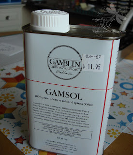
Gamsol (picture of the container that I purchased is to the right) is the blending medium usually used with the pencils. It is odorless mineral spirits. (I'm not sure if regular mineral spirits would work? If someone knows that answer, let me know!) I purchased one of those pump bottles that nail techs use to produce a "puddle" of the Gamsol in a little "well" when the top of the pump is pushed. I think that this works best for me. I bought mine at a local place, called Craft Depot, though I'm sure it can be found at most art stores.
The Gamsol is "applied" or used with Stumps. These are sort of like paper pencils. They are densely wrapped "sticks" that can be sharpened with sand paper, or an emery board. With the Gamsol and the friction of the "rubbing", the stump breaks down the wax in the pencil, and allows you to easily blend colors. They come in a variety of sizes, and are sold at craft stores like Michael's.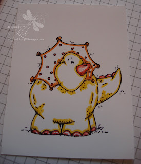
*******
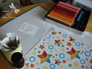
Now enough of that pseudo-scientific stuff! The very top picture shows how I almost always start out for a project like this. I have my stamped image, Prismas, Mug-o-Stumps, bottle of Gamsol, and the patterned paper that I want to match the image up to.
The third pic shows what I do first. I outline the image with all of the colors that I "think" I want to use, making sure to pay particular attention to the "shade marks". On this particular image, they used little dots and lines. I make sure that the color is especially dark there.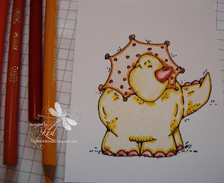
Next thing I do is lightly, with the side of my pencil, color in the rest of the image. If you make the marks too dark, they are sometimes difficult to blend. I said above the colors I "think" I want, because some colors look lighter when they're "gamsoled", and some look darker, so many times I need to adjust accordingly. The beauty of the pencils, though, like I said before, is that the colors blend very nicely.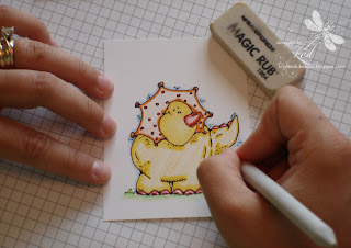
The next picture shows me, and my finely manicured hands (yeah, right!), using the stumps. Make sure, if you're thinking of taking the plunge with these pencils, that you also grab one of those erasers (Magic Rub) when you're at the store. It's a miracle worker. Not only will it erase mistakes, but it also is a shading tool!
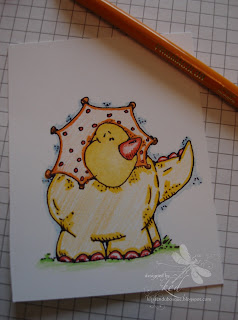
As you can see in the next pic, I'm "recoloring" the yellow. I'm doing this because I wasn't matching closely enough to the yellow in the PP.
Do you see the slight light area in his face? That is supposed to be there. You can either color it that way from the beginning, OR use your eraser to remove the color. THEN reblend it with your stump. The idea is to blend the color in from the outside edges, so that when you get to the center of the image, you have less color, looking like light reflecting off the image - making it more life-like.
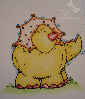
The next pic shows the dino fully colored in the yellow areas, but it needs some more shading. Also, it shows the "grass and sky" around the dino. Like "inside" the dino, I paid close attention to where the artist placed the shading marks. (The beauty of a Whipper Snapper stamp! House Mouse stamps are even MORE shade-friendly!) I blended the grass by "pulling" the color from the "foot-line" down till the color runs out. This technique creates an even shade and an elevated "mound". I did the same thing with the blue, pulling it out from the body.
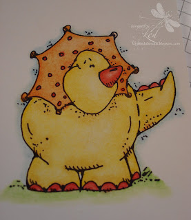
This next picture (we're almost done!) shows the nearly finished product. I colored the orange area (don't know what that thing's called!) and nose, spikes, and nails. I decided to add a bit more shading with a shade darker pencil for both the yellow and orange areas. This just adds more depth. Again, I concentrated on the all of the image lines, and blended.
He's pretty bright, but I think he turned out pretty cute. Keep scrolling down, you're nearly there! :)
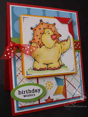
So here it is! The completed card. I hope that I didn't disappoint or bore you to tears with this tutorial! I apologize for the extreme wordiness, but I don't know how to describe the process in any other way! If you have any other questions, regarding the Prismacolor Pencils, please don't hesitate to email me.
[Reposted: This card was published in the Nov. issue of Cards, pg.165.]
Have a super great Hump Day, and I'll see you tomorrow!
xox,
k
**********
ETA: A couple of people had some good questions that I wanted to address - I knew I'd forget something! lol First, YES Stampin' Up! Whisper White is what I use for this technique, NOT Watercolor Paper. I tried that on an earlier card, and I really had to "scrub" the colors to blend them. (Thanks, Leslie!)
Also, I use the Palette Noir ink for this, rather than the Stazon, because the Gamsol will make the Stazon bleed. Basic Black should work okay, too, though.
And lastly, the dragonfly is one of my tattoos. (Blushing.) There were a few of you who got it right! But the several comments about it being a metaphor for me in my crafting journey, etc... really made me smile! ;) I'm kind of sorry that it wasn't more insightful than that, now! LOL (Thanks for reminding me, Heather!)
Fine Print...
Stamps - Whipper Snapper, Papertrey; CS - Red, WW, Sun, Pumpkin, Galore (sponged with Olive to better match the paper); Ticket Corner punch; May Arts ribbon; SU! Oval Punches; Imaginisce PP; Twinkle Stickers; and of course, Prismacolor Pencils, Stumps, Gamsol
 Today is the day to head on over to My Favorite Things to pick up this set, Hit the Beach! It was just released today!


 So, after an exhausting day, I get home to THIS (below). My husband had completely reorganized my ENTIRE stamp room. (Is your jaw on the floor yet???) I walked in the room and just stared. Not sure if you can tell a difference from the pic, but
  While I'm still finding and looking for my beloved treasure - and REorganizing them, I AM getting kind of used to the computer being in here. Below is the pic of how it looks today. I'm still shuffling things around, but all in all, I thank him for it. I love my room.


 Oh yeah, did you notice my coolio new watermark???


